-
Alphabet
I picked out the letters of my sister’s name to stand out on this card. I would like to have the letters look more elegant. I think this will come with practice.
-
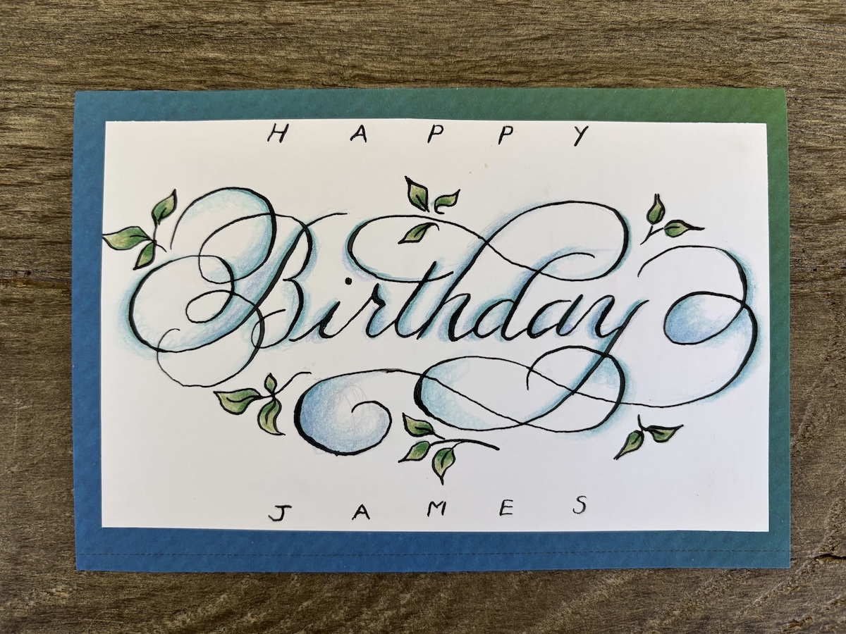
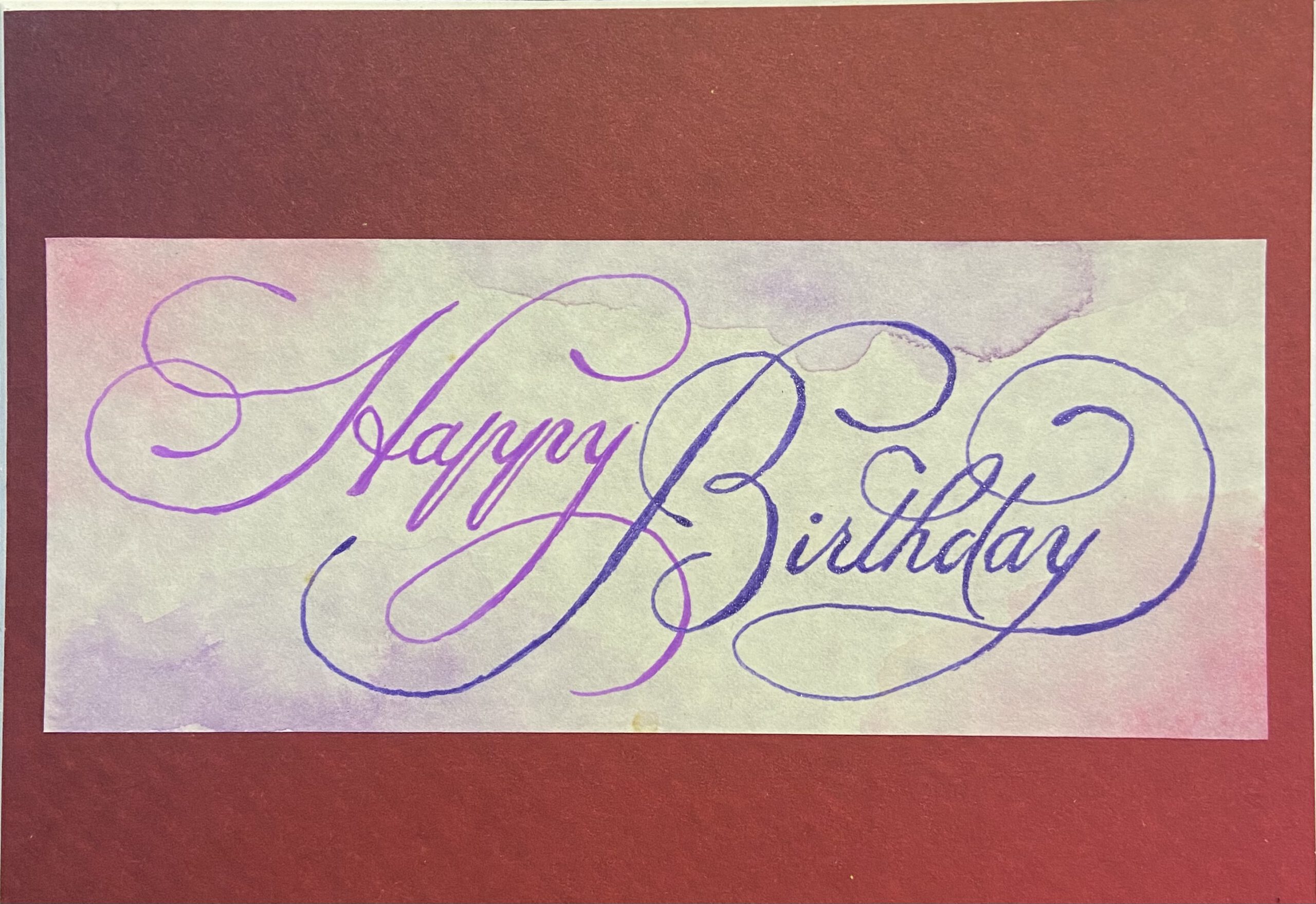
Birthday Card
Again – same problem with uneven lines. I think I may have to go slower. I enjoyed trying out colored pencil in this one.
-
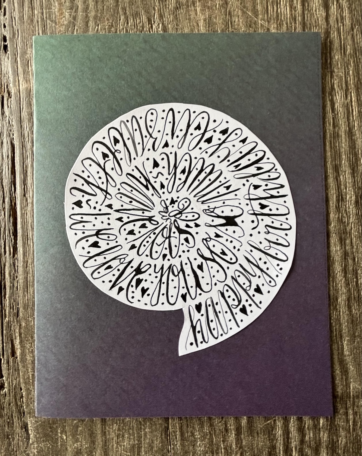
Spiral Calligraphy
This was fun to do (even though it’s very hard to read the text!) Again the ink pooled quite a bit. I wonder am I rinsing the nib enough.
-
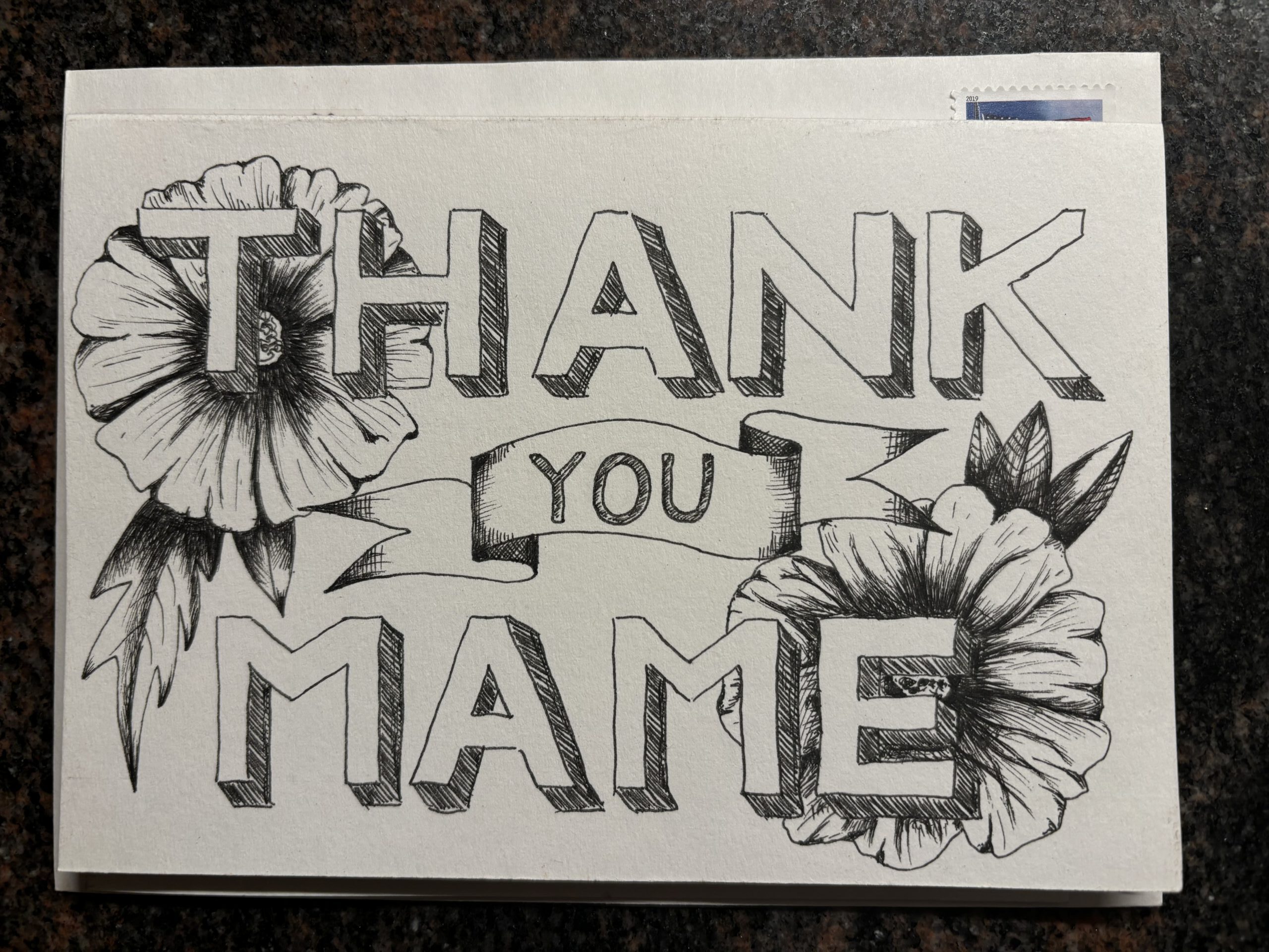
Thank you Card
This was just drawn using a regular pen. I wish I’d placed the flowers in a different position and somehow everything looks a bit “boxy”.
-
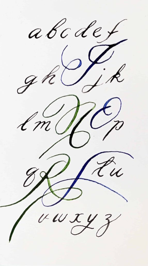
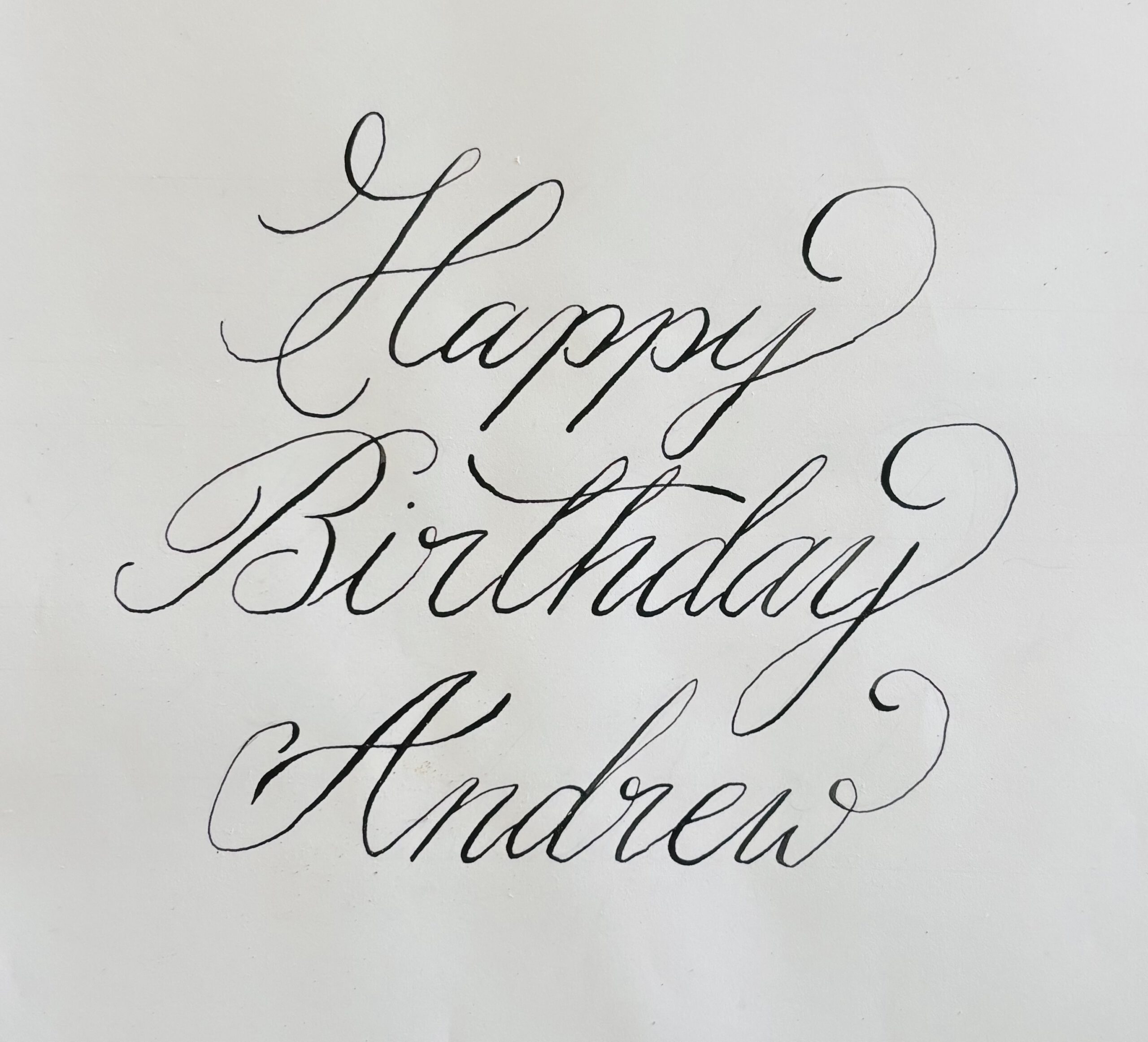
Calligraphy Style 2
This was “faux” calligraphy. It’s hard to get the lines to flow – so it looks very uneven. Good fun to experiment with colors though.
-
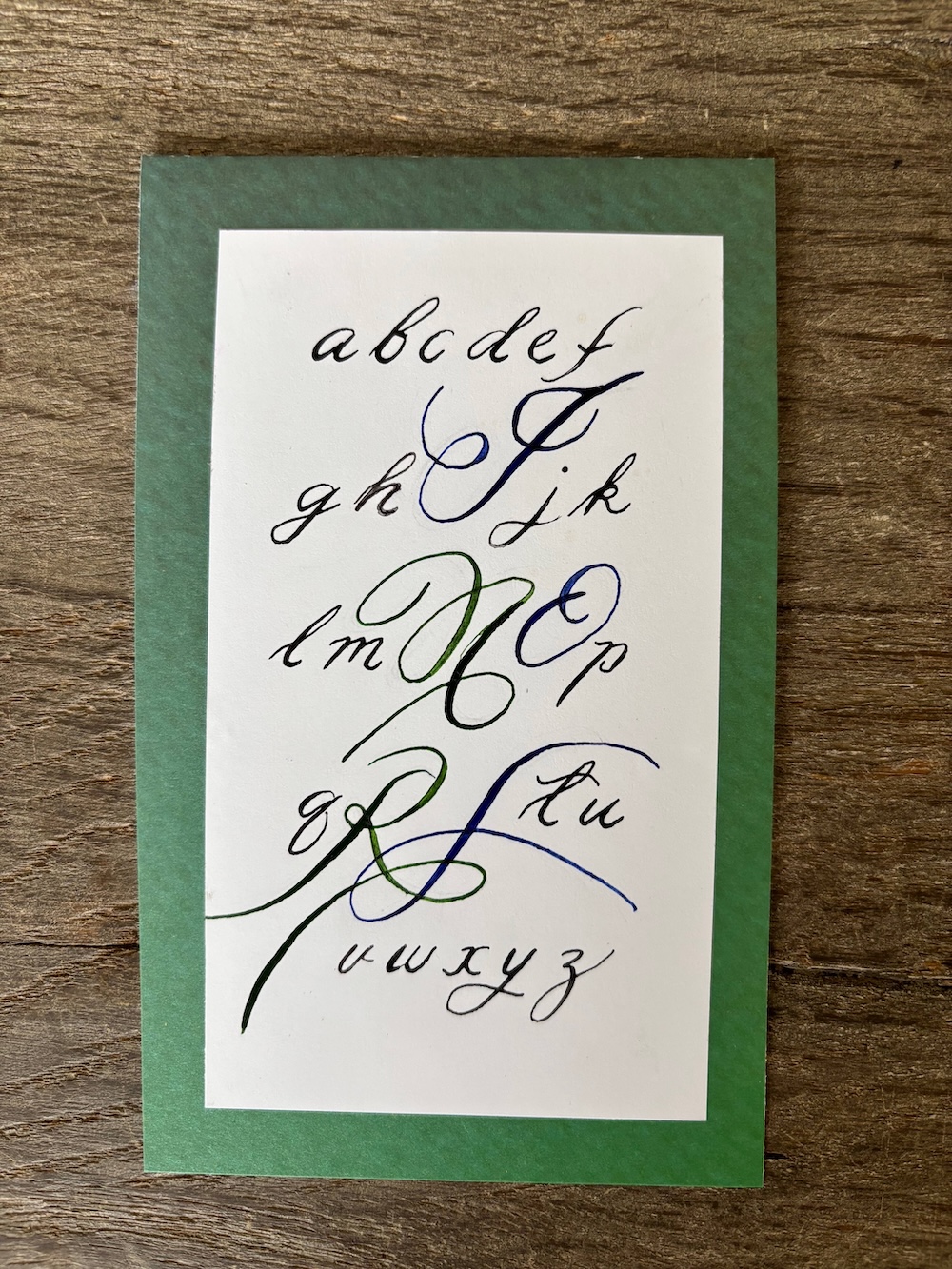
Calligraphy Style 1
This was my first attempt. Still such a lot to learn.
It was hard to stop the ink pooling and the strokes are certainly wobbly and uneven.