CSS Worklet commands let CSS run small, performant pieces of JavaScript (called worklets) on a separate thread, enabling advanced visual effects, animations, and layout calculations without blocking the main thread.
The problem they solve
Traditionally:
JavaScript animations and computations run on the main thread
Complex effects can lag or drop frames
CSS itself is limited to declarative properties
CSS worklets bring off-main-thread processing for certain CSS features:
Paint worklets → custom painting
Layout worklets → custom layout logic
Animation worklets → fine-grained animation control
Types of Worklets
1️⃣ Paint Worklets
Draws custom visuals in CSS
Replaces images, gradients, patterns, etc.
Runs on a separate thread
Example:
// my-paint.js
registerPaint('stripes', class {
  static get inputProperties() { return ['--stripe-color']; }
  paint(ctx, geom, properties) {
    ctx.fillStyle = properties.get('--stripe-color').toString();
    ctx.fillRect(0, 0, geom.width, geom.height);
    // more painting logic...
  }
});
.box {
  animation: spin 2s linear infinite;
  animation-timeline: scroll();
}
Benefits
High performance (off main thread)
Browser-optimized
Enables effects not possible with plain CSS
Safe for accessibility (focus / motion preferences respected)
2. Customizable form elements
Modern CSS provides new pseudo-classes, pseudo-elements, and properties that let you style native form controls more flexibly and consistently without removing their accessibility or replacing them entirely.
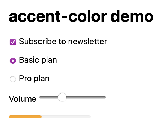
1️⃣ accent-color
Sets the “theme color” for checkboxes, radio buttons, sliders, progress bars
The animation runs as the element enters and leaves the viewport.
Why this is a big deal
compositor-driven (very smooth)
browser understands layout + scroll
espects prefers-reduced-motion
no JS math or listeners
Typical use cases
progress bars
parallax effects
fade/slide on enter
storytelling layouts
section reveals
3. New color functions
Modern CSS color functions let you define colors in perceptual color spaces, making color adjustments more predictable, accessible, and design-friendly.
Why new color functions were needed
Older formats (rgb(), hex) are:
device-based
not perceptually uniform
hard to adjust logically (lighten, darken, mix)
New functions fix this.
Key modern CSS color functions
🎨 lab()
color: lab(60% 40 30);
Based on CIELAB, a perceptual color space
Changes to lightness behave how humans expect
Great for accessible color systems
Mental model:
“If I increase lightness, it actually looks lighter.”
lch()
color: lch(60% 70 40);
Lightness, Chroma, Hue
Easier for designers than LAB
Ideal for gradients and themes
Very popular for design systems
oklab() & oklch()
color: oklch(65% 0.15 240);
Improved perceptual accuracy over LAB/LCH
Better hue consistency
Increasingly recommended for modern work
Best choice today for color systems.
color-mix()
color: color-mix(in oklch, red 40%, blue);
Mixes colors in a chosen color space
Predictable results
Great for hover states and themes
color()
color: color(display-p3 1 0.5 0);
Access to wide-gamut color spaces
Supports Display-P3, Rec2020, etc.
Enables richer colors on modern displays
relative-color() (emerging)
color: relative-color(currentColor lch l +10%);
Adjusts a color relative to another
Ideal for hover / active states
Still evolving support
Why this matters in real projects
Better contrast control
More consistent themes
Easier dark mode
Fewer magic numbers
4. @property (custom properties)
@property lets you register a CSS custom property with a type, initial value, and inheritance behavior, so the browser can understand and animate it properly.
Around 2023, CSS gained several native typography features that used to require hacks, JavaScript, or extra markup. These give you better control over:
text wrapping
drop caps and decorative initial letters
hyphenation behavior
spacing and line control
🔡 1. text-wrap: balance
What it does
Balances text across multiple lines, minimizing rivers or big uneven line breaks — especially useful in headings.
Example
h1 {
  text-wrap: balance;
}
Before:
Amazing
New Feature
After:
Amazing New
Feature
Why it matters No JS or manual line breaks, just better line distribution.
✨ 2. initial-letter
What it does
Creates native “drop caps” or styled initial letters without extra HTML.
Result Classic magazine-style initials with minimal CSS.
🧵 3. Better text wrapping & overflow control
text-wrap variations
balance → tries to even out line lengths
unbalanced → default behavior
overflow-wrap
Already old, but now more consistent:
p {
  overflow-wrap: break-word;
}
Ensures long words don’t overflow containers.
🪶 4. Hyphenation improvements
CSS
p {
  hyphens: auto;
}
What it does
Lets the browser insert hyphens when needed
Works especially well on narrow columns
Bonus Combine with language:
<p lang="de">…</p>
Affects how words break correctly in German, French, etc.
🚀 5. line-break & international text control
Example
p {
  line-break: strict;
}
Helps with:
CJK text (Chinese/Japanese/Korean)
Better line break rules per language
📏 6. More control over spacing
Features like:
text-indent
letter-spacing
word-spacing
line-height
have become more consistent and well-behaved with modern layout systems (Grid, Flexbox, Container Queries).
🧠 Why these matter now
Before:
balancing lines → JS or manual <br>
drop caps → extra HTML + positioning CSS
hyphenation → inconsistent or impossible in some browsers
Now:
purely CSS
cleaner HTML
responsive-friendly
3. Trig functions
CSS now includes a set of trigonometric functions and other math helpers that let you perform math directly in your stylesheets — no JavaScript needed. These are part of the CSS Values and Units Module Level 4 and now have broad support in modern browsers.
🔁 Trigonometric functions
These work like in regular math:
Function
What it returns
sin()
Sine of an angle (–1 to 1)
cos()
Cosine of an angle (–1 to 1)
tan()
Tangent of an angle
asin()
Inverse sine (number → angle)
acos()
Inverse cosine
atan()
Inverse tangent
atan2()
Angle from two values (y, x)
You can use angles in units like deg, rad, and turn.
aspect-ratio is a modern CSS property that lets you tell the browser “this box should keep this width-to-height proportion” — without hacks, wrappers, or JavaScript.
What aspect-ratio does
aspect-ratio: 16 / 9;
This means:
For every 16 units of width, keep 9 units of height.
The browser will calculate the missing dimension automatically.
CSS logical properties may feel “optional” at first, but once they click, they make a lot of sense—especially for internationalisation and modern layouts.
The core idea (plain English)
Physical properties describe screen directions:
top / right / bottom / left
Logical properties describe content flow:
start / end
block / inline
So instead of saying:
“Put space on the top”
you say:
“Put space at the start of the block direction”
Block vs inline (most important concept)
In normal English text (default)
writing-mode: horizontal-tb;
direction: ltr;
Block direction → top → bottom
Inline direction → left → right
So:
Logical
Physical equivalent
block-start
top
block-end
bottom
inline-start
left
inline-end
right
margin-block-start
.card {
  margin-block-start: 1rem;
}
This means:
“Add margin at the start of the block flow”
In normal English text, this behaves exactly like:
margin-top: 1rem;
Why not margin-start?
Because start of what?
CSS separates two axes:
Block axis → paragraphs stack
Inline axis → text flows
So you must specify which axis:
margin-block-start
margin-inline-start
There is no plain margin-start.
Common logical property mappings
Margins & padding
Physical
Logical
margin-top
margin-block-start
margin-bottom
margin-block-end
margin-left
margin-inline-start
margin-right
margin-inline-end
padding-left
padding-inline-start
Size & positioning
Physical
Logical
width
inline-size
height
block-size
top
inset-block-start
left
inset-inline-start
Example:
.box {
  inline-size: 300px;
  block-size: 200px;
}
Why logical properties exist (the real reason)
They exist for internationalisation and writing modes.
const spider = document.getElementById("spider");

  // starting position
  let x = 100;
  let y = 100;

  // velocity (px per frame)
  let vx = 6;
  let vy = 4;

  function animate() {
    x += vx;
    y += vy;

    // bounce off left/right edges
    if (x <= 0 || x + spider.offsetWidth >= window.innerWidth) {
      vx = -vx;
    }

    // bounce off top/bottom edges
    if (y <= 0 || y + spider.offsetHeight >= window.innerHeight) {
      vy = -vy;
    }

    // update position
    spider.style.left = x + "px";
    spider.style.top = y + "px";

    requestAnimationFrame(animate);
  }

  animate();
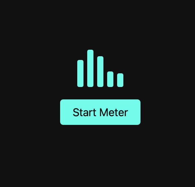
Click on the blue button above to see the animation!
How does this work?
The .meter CSS class :
puts the bars next to each other
spaces them out
gives a little room above the button
Each bar has the .bar class which :
starts small (20px tall)
has a cyan colour
has a soft rounded edge
has an animation named pulse
BUT — the animation is paused until JavaScript starts it. The CSS stagers the animation so each bar start slightly later than the one before. They ripple instead of all moving together.
The animation CSS says :
Start short → grow taller → shrink again.
Repeat forever.
This is why the bars look like a moving sound meter.